The Henderson’s Home
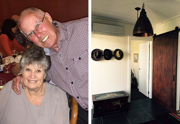
After a number of years living in a motorhome and travelling around New Zealand, Smillie and husband Grant embarked on designing and building the perfect home for their retirement in Taupo.
Builder: Mike Darvill - Bayline Construction Taupo
Heat Pumps supplied by: Chris Kitzen - The Air Conditioning Company
Heat Pumps installed by: Stuart Groombridge - Groombridge Refrigeration Taupo
How would you describe your style?
I would describe our style as eclectic. Combining well-loved furniture and objects unique to us, collected over many years, with several new pieces to achieve a home where we will be very happy to spend our retirement years.
What’s your favourite room in your home?
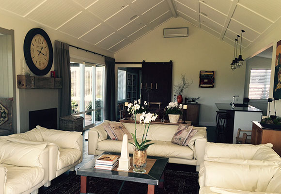
My favourite room is the living-dining-kitchen area. The soaring ceiling and extra height stud, coupled with all day sun and a vista out to native bush land, creates a space that is relaxing and very easy spend time in whether it be with friends or family, or quiet time on our own.
Who designed your home?
We didn’t use an interior designer. Many years ago I [Smillie] studied interior design with Nanette Cameron, this gave me a good understanding of the basics of interior design history and the use of colour and balance. Stu Sizemore, from Astute Design in Taupo, designed the house after consultation with us. His vision and attention to detail with our house plans has enabled us to create a timeless, lodge style home on a limited budget.
Which of your possessions best describes you and your home?
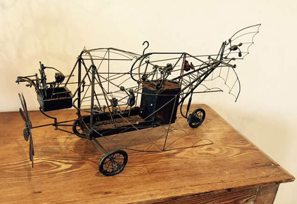
My favourite piece of art in our home is a Kinetic Art wire sculpture by an American artist Bruce Salinger, purchased in the USA nearly thirty years ago. The sculpture we call 'The Flea Plane’ depicts six metal fleas attached to a plane. It is battery operated and brings smiles to faces when we flick the switch and the propeller, wings and tail all move in unison. It is rather whimsical and has rusted slightly with age (somewhat like us really in our retirement years) but this adds to its uniqueness.
Why did you choose Mitsubishi Electric Designer Series Heat Pumps for your home?
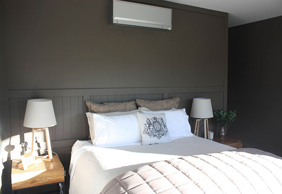
We chose the Mitsubishi Designer Series as we were looking for quiet, efficient units which would blend in with the styling of our new home. The efficiency, aesthetic look of the Designer Series coupled with Wi-Fi Control and the colour selection were the final deciding factors for us. We have three silver Designer Series installed - an EF50 in the living-dining-kitchen area, an EF35 in the hallway and finally an EF25 in the main bedroom.
Why did you choose silver?
We chose the silver for the three units because the finish suited the Resene wall colours we chose for the house. The white heat pump would have been too stark and the black’s shiny finish would have been too much of a contrast.


